Logo & Lockup
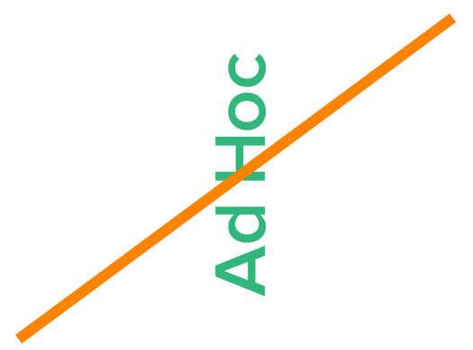
Our logo should primary be used as a full mark (logo mark and word mark). Symbol only use requires approval from our creative and communications team. The word mark is never used in isolation.
Usage

Do not separate the symbol and word mark.
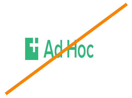
Do not rotate.
Do not squash or scale.

Ensure space around the logo equal to half the size of the symbol.
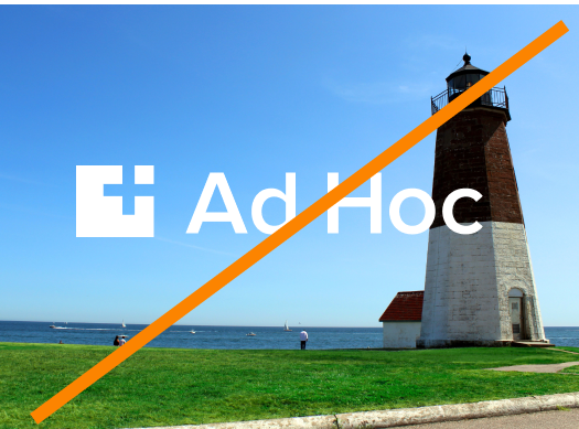
Do not overlay the logo on an image without explicit approval.

Do not recolor the logo.

Do not add drop shadows.

Do not add an outline or stroke.
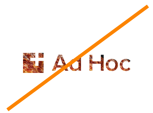
Do not add a background fill (including pizza). This includes the use of a diffusion model to draw an image out of the noise conditioned on the logo.